Screen-printing reached independent record sleeves not as a design choice but as an economic one. Offset lithography required film separations, plate-making, and minimum quantities that made short runs prohibitive. Screen-printing, by contrast, could produce fifty sleeves in an afternoon with a squeegee, a wooden frame, and a pot of ink. That accessibility is why the process left such a distinct mark on British independent electronic music in the late 1980s and through the 1990s — and why so many sleeves from that period look the way they do.
The process begins with a mesh stretched tight across a frame, historically silk but by this period almost universally polyester. Mesh count — measured in threads per inch — determines how much ink passes through and therefore how fine a printed edge you can achieve. A low count (around 43–60 TPI) lets through a heavy ink deposit and suits bold graphics or solid fills. A higher count (110 TPI and above) holds finer detail but demands a thinner ink and a more forgiving substrate. Grey board — the uncoated, recycled-pulp card that gave many independent sleeves their characteristic rough surface — sits awkwardly at the higher end of that scale. Its fibrous texture bleeds fine lines. On grey board, fine detail turns to fur.
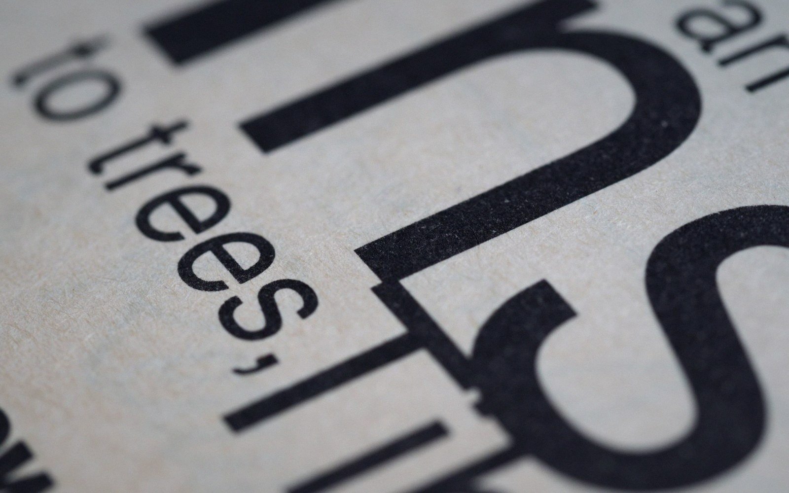
That bleed was not a flaw designers worked around; it became the texture they worked with. Clean, sharp typography printed on grey board develops a slight halo, a penumbra where ink has wicked along the surface fibres. Run the same artwork through an offset press onto coated stock and the graphic reads as calculated. Run it through a screen onto grey board and it reads as physical — as something made by hand under pressure.
Ink, registration, and the signature error
Ink opacity matters more on an uncoated surface than anywhere else. The grey board absorbs rather than reflects, which means a standard process ink — mixed for transparency on white coated stock — can look washed-out or muddy when printed directly onto it. Independent sleeve printers compensated with dense, high-opacity formulations: whites loaded with titanium dioxide, blacks carrying a heavy carbon content. A single colour printed at high opacity on grey board reads with more contrast than two colours printed on coated paper. This is partly why so many independently-pressed sleeves from this period use stark, limited palettes — the constraint was chemical before it was aesthetic.
Multi-colour work introduced registration. Each colour requires a separate screen and a separate pass through the press. On a manual flat-bed screen-print operation — the kind a small workshop or a determined label could run themselves — aligning each pass precisely is difficult. Frame clamps help; operator care helps more. But on a run of two hundred sleeves with hand-fed stock, a consistent half-millimetre drift across the run is typical, and a two-millimetre drift at the edges of a stack is unremarkable.
What that drift produced is now one of the most recognisable features of independently-pressed electronic music packaging. The slight misalignment where a red ink layer sits two millimetres south of the black linework it was meant to underlie; the ghosting around letterforms where a second pass slightly missed the first. These are not uniform across a run — each sleeve is individually placed, individually pulled, individually wrong in its own specific way. The variation is what distinguishes genuine screen-print from digitally-simulated screen-print, which is uniform in its imperfection.
Each colour requires a separate screen and a separate pass through the press.
How the process shaped what was designed
Knowing the process was constrained, designers — often the same person pressing and distributing the record — worked with the grain of what screen-print does well. Bold, closed shapes hold their edges better than fine lines. Geometric forms register more forgivingly than type set small. A single-colour design printed in one pass as a halftone can suggest complexity without requiring precise multi-pass alignment. Some sleeves used the grey board itself as the third colour: a red and black two-colour print reads as red, black, and grey, even though no grey ink was ever mixed.
The desktop publishing tools that arrived in small studios from the late 1980s changed the origination side of this workflow, allowing precise positive artwork to be output on a laser printer and then photographically transferred to screen emulsion. But the physical act of pulling ink through mesh onto absorbent board remained unchanged by software. The design might begin digitally; the result was still analogue in every physical sense.
The economy of the process was real and the constraints were real, but neither is quite the full explanation for why grey-board screen-print became its own visual language. The more complete answer is that the people making these sleeves were close enough to the physical process to understand it, and worked with it rather than against it. They chose grey board because it was cheap and available; they chose bold graphics because the process demanded it; and the errors that crept in at the edges of each run were accepted not as failures but as evidence — that the record existed, that someone made it, that it came from somewhere specific and small.