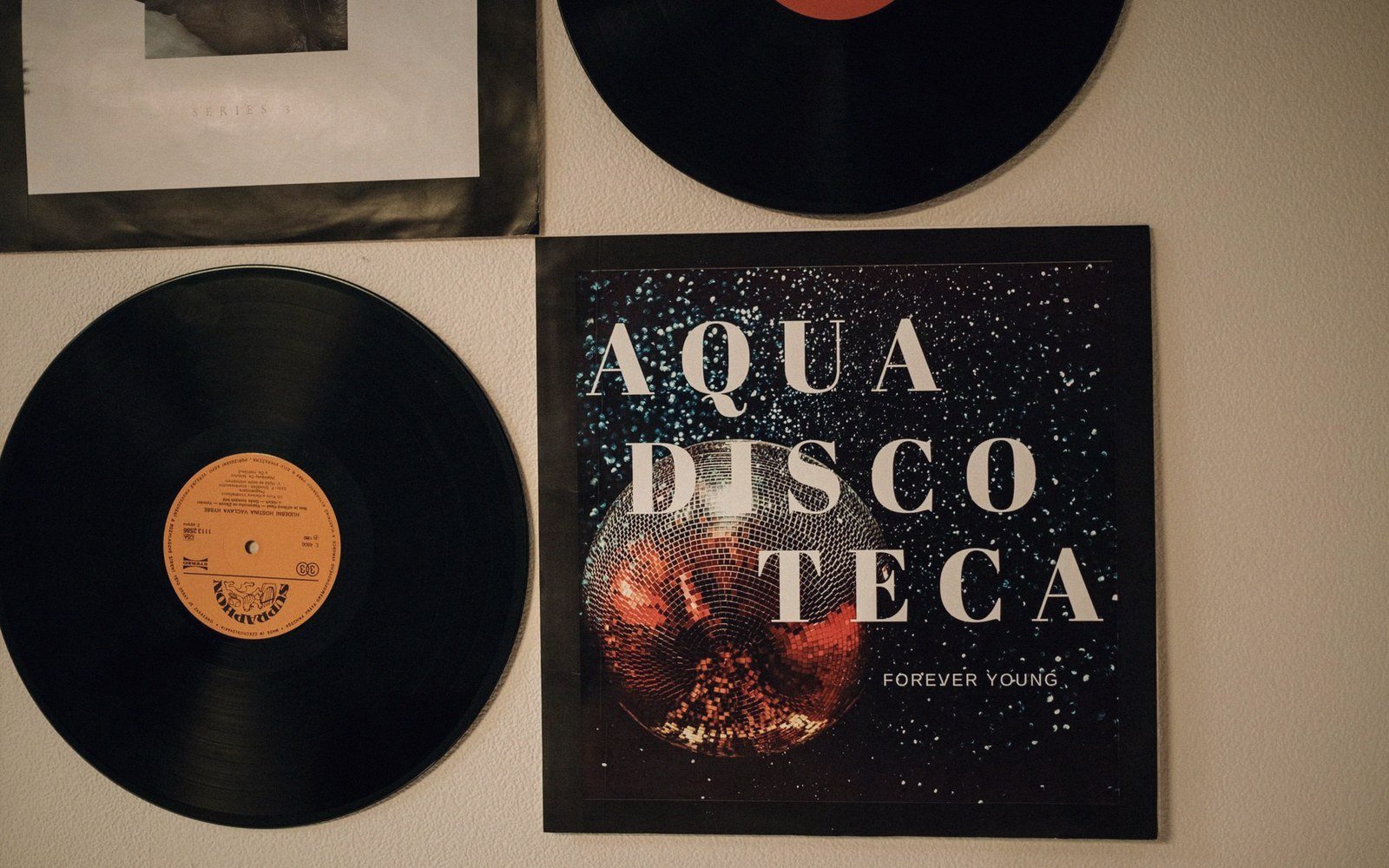
Independent labels didn't hire designers. They knew someone who had just bought a Macintosh, or they were the someone who had just bought a Macintosh. By the late 1980s, Aldus PageMaker and early versions of QuarkXPress had made it theoretically possible for anyone to set type and arrange a layout without involving a typesetter or a repro house. Theoretically is doing a lot of work in that sentence.
The gap between what the software promised and what the hardware could deliver was enormous, and the results are still legible on the sleeves that came out of it. Bad tracking across a headline. A font stretched horizontally to fill a box because nobody had yet grasped that type has proportions. Bitmap screen fonts printed at 72 dpi because the label couldn't afford a PostScript laser printer, let alone imagesetter output. These aren't signs of laziness; they're a precise record of what independent electronic music labels could afford to do with technology that was genuinely new.
The Specific Artefacts
PageMaker ran on a 512K or 1MB Mac and let you place text blocks and images on a pasteboard. In principle, this was everything a sleeve designer needed. In practice, the font library was thin — a handful of PostScript Type 1 faces if you had Adobe's packages, or the system bitmap fonts if you didn't. Chicago, Geneva and Monaco were screen fonts designed for legibility at small sizes on a low-resolution monitor, not for printing. When sent to a standard dot-matrix or early laser printer, they reproduced at screen resolution: blocky, aliased, each letterform built from visible square pixels.
Some designers used Fontographer, Altsys's font editor, to build custom letterforms. The results ranged from accomplished to chaotic, and chaotic was sometimes the point — particularly in the ambient and early braindance material coming out of Warp and its contemporaries, where unreadable type as a statement of aesthetics was already an established move. A font that looked slightly wrong, slightly off-grid, matched the sonic world of 12-bit samplers and detuned synthesisers.
Kerning was another consistent tell. PageMaker's auto-kerning used metrics embedded in the font files, and early PostScript faces had inconsistent kern pairs. The gap between a capital "T" and a lowercase "o" in a headline might be optically disastrous, and unless you were manually adjusting pair by pair — a process most label operators had neither the time nor the training for — it stayed that way. These gaps are visible on hundreds of sleeves from the period. They're not affectations; they're the software's defaults left in place.
Then there was reproduction. A finished layout had to get from screen to print somehow. For many labels, the cheapest route was a 300 dpi laser print, sometimes photocopied further to reach the quantity needed for a small pressing, then photographically shot to film for the printer. Each generation of reproduction degraded the image. Solid black areas held up reasonably well; fine serif type or thin rules did not. The practical response was bold faces, high-contrast layouts, and an avoidance of anything that required fine detail — which fed directly into the hard graphic language associated with much independent electronic music from the period.
Halftone photography was a separate problem. Importing a greyscale image into PageMaker and printing it on a laser printer produced a coarse, grainy halftone that could look striking or could look like a photocopy of a photocopy, depending on tolerance. Labels working at low budgets often embraced the look, partly because they had no alternative, partly because it rhymed with the cut-and-paste aesthetic already established in punk and post-punk record sleeves.
What the DTP generation produced, then, was a body of work defined by constraint. Not the chosen constraint of a skilled designer working within a grid, but the hardware constraint of machines with limited memory, limited font rendering, and limited output resolution. The artefacts are real: they are in the kerning tables, the bitmap rasterisers, and the photocopier optics. They are also, at this distance, the clearest possible record of how the technology was actually used — and what it cost to press a sleeve in an era when the Mac was new and PostScript was still an aspiration.